As a member of the Decorator and Digital Solutions Team, one of the luxuries of my job is the ability to explore and research the challenges that decorators face. We strive to learn every day and are eager to share those experiences any time we can.
Recently, a decorating challenge came in about screen printing on a tie-dye t-shirt. At first it seemed to be a pretty straightforward and simple question. But it ended up sending me careening through information trying to figure what had gone awry. What started with a simple t-shirt quickly evolved into a myriad of hows, whys and what ifs.
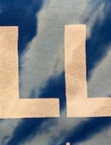
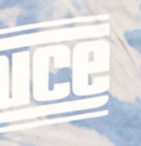
For this particular issue, the discharge process that was being used did not successfully clear the pigment away from the shirt. It left sections of the darker pigment showing through the ink. This could have been much worse had the tie dye been more than one color. What appeared as strike through could have easily turned into an unreadable mottled mess. The strike through could have possibly been incorporated into the design, but it was not acceptable for this particular job.
To find a solution, I first looked at the garment. Several factors needed to be considered. The pigment dye used was a factor and reacted predictably with screen print discharge ink. This was surely going to be varied to some degree across the job. Having that type of inconsistency tends to drive the customer to refuse some shirts (or sometimes all). It also leaves the screen printer without a reliable way to confidently produce the job to the customers liking.

An article in Impressions from August 2019 illustrates how to print on tie-dye with water based inks. They also claim that nearly all ink will work if done correctly. Be prepared to test and adjust your preferred ink selection to ensure your best work.
Another issue that can come up with tie-dye shirts is that the fabric can be quite fibrous or fuzzy. This can easily be addressed by using a roller squeegee.
The last piece of advice is to consider your work in the long term. Tie-dyes tend to fade a design. It may look great at printing but as the shirt begins to lighten your design may get lost. When printing light colors, consider adding a contrasting outline to keep the design’s integrity.
